Misha Tsvelik
Best practice to optimise mobile survey design
Mobile devices are increasingly being used to access online surveys. Here I examine how device diversity impacts online data collection, using evidence from our recent studies to outline best practices in survey design and build to optimise data quality.
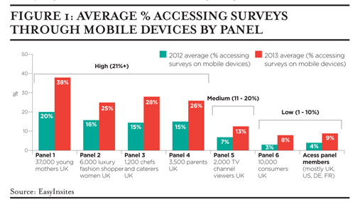
At EasyInsites, we manage custom panels and communities. This enables us to look at some interesting data points. Figure 1 shows the average proportion accessing our online surveys through mobile devices by panel.
Average % accessing surveys through mobile devices by panel
There is a marked increase in mobile survey taking from 2012 to 2013, and it has nearly doubled for the young mothers panel over a year. There is considerable variation in mobile device usage between the panels which we have grouped as follows:
- Low usage (1-10%): Access panel respondents. The panels are usually created so researchers can purchase access to panellists, and there is a limited amount of control over survey content and optimisation.
- Medium usage (11-20%): TV and media. The increasingly prevalent phenomenon of ‘device multi-tasking’ whilst watching TV is likely contributing to this.
- High usage (21% +): Young mothers (frequently on the move) and parents, wealthy shoppers (can afford top technology), chefs and catering (mostly not desk-based jobs).
This data underlines how important it is to understand mobile survey-taking patterns within your audience and, thus, which question types to use, the best survey length and which platform to use for scripting.
EasyInsites research in early 2012 into usage, preference of devices for surveys and survey-taking habits across five large markets in Europe and the US showed:
A higher proportion of mobile device owners preferred to take surveys on those devices than desktop owners on desktops, if surveys were optimised.
Many questions took longer to complete on smartphones, particularly radio button/checkbox grids and essay questions.
Problems with surveys on mobile devices were much more common (by a factors of 2+) than desktop. Frequently cited problems included lack of support for Flash; non-optimised surveys being difficult to navigate on touchscreens because of small text; form elements; buttons; and the need for constant screen resizing.
It also showed that mobile respondents tend to be an important target group because they include early technology adopters and wealthier shoppers.
We then studied the effects on data quality of optimising (or not) surveys for mobile respondents by putting five segments of respondents through a survey collecting the same data but with varying levels of optimisation and on different devices.
Our segmentation
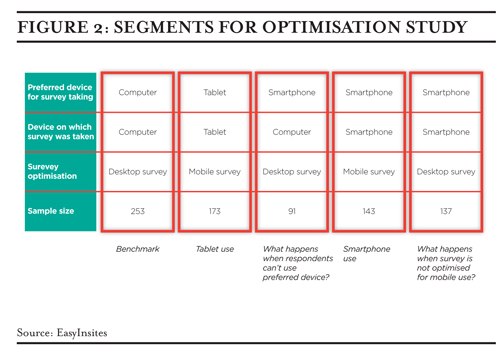
We took 944 respondents from a UK panel of young mothers through a 5-10 minute survey (thus working with an audience of high mobile device usage and minimising the potential for results being driven by demographic differences). We started with a quick screener asking respondents to specify their preferred device for online surveys and then asked them to take the survey on the device they had mentioned.
Our benchmark segment (1) included those preferring to complete the survey on a desktop, who were served the desktop optimisation, the usual case for most online surveys today. We optimised the survey for mobile devices and fielded it to those on their preferred devices: tablet (2) and smartphone (4). We also looked at what happens when respondents completed a survey designed for desktop on their preferred smartphone (5) and when they were asked to complete the survey on their desktop rather than preferred smartphone (3).
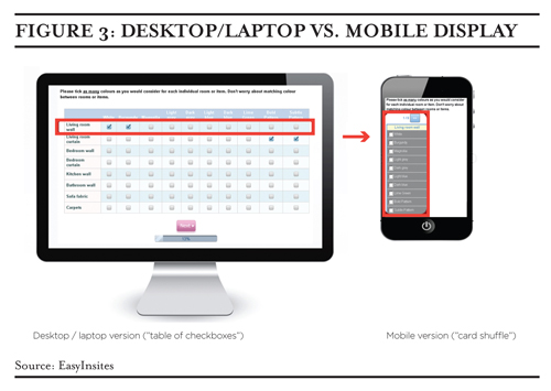
We asked respondents to choose which colours and patterns they would consider for different areas of their house (multi-choice checkbox grid question). Then, out of the original list of colours, they were asked to choose one for each area of the house (single choice radio button grid question). These questions were designed to ensure that everyone would have a preference out of the options (to avoid ‘None of these’ choices affecting the distribution of answers). This also enabled us to take the grid to a large 8 rows by 10 columns, a size similar to that used in other surveys.
Our ‘card shuffle’ technique transformed a large grid of questions into a display that was easily evaluated a row at a time on mobile devices. Figure 3 shows how we optimised grid questions for mobile devices. The project also enabled us to test the impact of the card shuffle technique, which we had developed in-house, on data quality. We measured different aspects of the data and survey-taking experience; here is what we found.
Engagement: Respondents going through the grids on mobile devices with the card shuffle method ticked significantly more answers per row than desktop or un-optimised smartphone grid respondents. This suggests higher engagement, but could also have been a result of respondents having to focus (as only one row was shown at a time) or the new and interactive nature of the card shuffle method.
Bias due to scrolling requirements when viewing large grids on small screens: When faced with a large grid on a small screen, you might expect respondents to select only from the options immediately visible rather than those on the far right which they need to resize their screen to see. Comparing the top and bottom two scores between segments, we found no significant differences between the segments, but we did notice that the top and bottom two scores of respondents with the card shuffle were 10%+ larger than other segments, which is consistent with their increased engagement.
Attention: Mobile respondents are intrinsically more likely to be on the move and possibly less concentrated on the survey. We tested this by measuring the number of respondents who selected a colour in the single choice grid for an area of their house which they had not selected in the multi-choice grid for the same area. There were very few (average 1.2 to 1.5) inconsistent answers in all segments. We also asked respondents a question at the start of the survey and asked them to recall the topic at the end. The recall rates were also uniformly high across all segments (99%-100% accuracy), indicating that attention levels are equally high across all devices.
Survey taking experience: Those taking the unoptimised desktop survey on smartphones scored significantly lower when asked to rate the survey on ‘Ease of use,’ ‘Format/layout of questions’ and ‘Overall experience.’ There were few differences between other segments; those taking the optimised survey on smartphone scored marginally highest on every experience metric.
Overall we were encouraged by our findings, which validated our mobile optimisation methods as providing equally as good – if not better – data compared to the desktop version and provided insight into the pitfalls of not optimising for mobile.
Our findings have helped us develop easy-to-apply methods of varying sophistication for optimising surveys for mobile devices. Whilst the ideal mobile survey would take no more than ten minutes, contain questions that fit neatly onto the screen and are universally accessible, this is not always possible, especially as taking mobile participants into consideration is relatively new for many researchers.
Here are our recommendations for designing and building mobile-optimised surveys:
- Know your survey audience. This will determine the value of optimising for mobile. It is important to know the mobile device penetration within your audience and to adapt and optimise surveys to the limitations these devices present.
- Choose an appropriate scripting platform. Some still have more advanced and interactive question types, like drag and drop card sort, built in Flash, whereas other platforms have been specifically developed for mobile devices. Ideally, use a platform that provides mobile respondents with an appropriately designed survey theme with large text, form elements and survey content with compatible basic question types that zoom to 100% of screen width to avoid resizing.
- Test your survey and questions you are unsure about on smartphones. Does your platform provide a preview mode where this can easily be done?
- Some questions just will not work on small screens, for example asking respondents to look at large images in detail. In this case, let respondents know up front in the invitation and/or survey introduction, and consider blocking smartphone respondents and telling them to revisit your survey on an eligible device.
Following these recommendations will lead to better data through good user-interface design, avoiding unnecessary survey length, happier respondents and a more inclusive sample.
Misha Tsvelik is Research Operations Director at EasyInsites UK


