The COVID-19 outbreak affected thousands of people and businesses in Iran – including the banking industry. Despite this, Saman Bank, one of Iran’s leading banks, known as a pioneer in providing beyond-the-normal customer services, decided to play its role in preventing COVID-19’s spread by empowering its mobile banking app in a country with high potential for mobile banking:
- Most people own more than one sim card
- Internet penetration (no matter the bandwidth) is over 90%
- People typically have 4-5 bank accounts
But there are challenges:
- Despite the potential for mobile banking apps, ATMs are still more popular. And only 1/3 of new bank customers install a mobile banking app per month. This is reflected in app’s low use for daily financial transactions
- As mobile phone ownership has risen, our ability to hold attention has declined. Between 1998 and today, scientists believe that our sustained attention span – the time spent continually on a task – has dropped from 12mins to 5mins and our “transient attention” span – the immediate reaction to stimuli – has dropped from 12secs to 8 secs. But how’s this related to banking? Well, this means that optimized User Experience is vital when it comes to mobile banking apps
To help Saman Bank’s mobile app to be functional, reliable, usable, convenient, pleasurable and meaningful to use, Formative UX Research was needed.
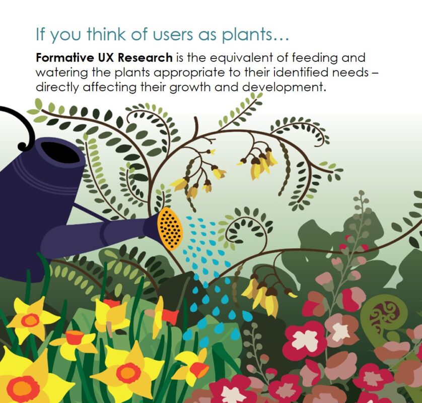
Formative UX Research – typically qualitative – is done early during product development to help form the product’s shape and design. Formative UX Research answers the why and how questions of the design’s usability. It answers why something isn’t working and involves evaluating a product during design and development. The goal is to detect any issues and eliminate usability problems before a product is fully developed.

Formative UX Research allows us to see how users experience a product’s design and see where and why they get stuck. It’s crucial to observe and understand the users’ thought processes and their resultant actions.
But how did Saman Bank use Formative UX Research?
1. What we did
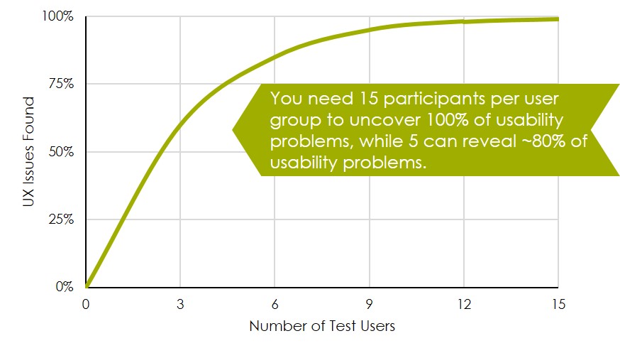
First, we had to decide on sample size. In UX Research it’s felt that 15 participants per user group will uncover 100% of UX issues and 5 participants around 80%. As you add more participants, you learn less because participants keep seeing the same issues. Each member of the sample was defined by their usage of apps as: rejecters, light users, average users and extreme users.

Finally, we decided to use an iterative testing approach with two rounds of tests:
Round 1: 5 participants tested the app’s UX to identify problems. Then app was amended accordingly
Round 2: The improved app was then tested with 5 new participants to validate improvements
This test was conducted across four different usage scenarios. For each operational scenario a starting point, ending point and all possible routes from starting point to ending point were identified.
The evaluation was based on Nielsen’s heuristics that describe the 10 general principles for interaction design and are rules of thumb for human-computer interactions. Key to this was heuristics #6 which states the design should be based on “recognition rather than recall”. This means that the user shouldn’t remember information from past experiences and instructions for using the system should be visible or easily retrievable whenever appropriate.
2. What we found out
Saman’s app’s UX was evaluated on:
- Ease – how long each scenario took to complete
- Success – could users complete each scenario
- Bottlenecks – barriers to completing each scenario
Each UX issue was recorded with:
- A pictorial description
- The issue’s root cause
- Emotional and functional impacts
- Potential solutions
The identified UX issues were prioritized based on number of occurrence and functional impacts. For post-usage evaluations, users’ perception on ease of use of the application was measured using:
- SUS (System Usability Score)
- NPS (Net Promotor Score)
3. How Saman used the research
Saman’s UX/ UI design teams made improvements on the app based on the priority of discovered UX issues. Several weeks after of study completion, not all the UX issues are solved, but solid improvements have been made. This together with in-branch/ call center support for installing the application and activating it for the first time, resulted in a higher rate of active usage of the application and higher satisfaction level of the app.


