How many times have you sat in a meeting through slide after slide of data…lots and lots of data? The insights have a tendency to get lost somewhere in the translation between information and insights. The sheer amount of data, stats, and facts can get in the way of those actionable insights.
One of my favorite ways of overcoming this mistranslation is through the tactical use of infographics.
Infographics are graphic visual representations of information, data or knowledge. – Wikipedia
Infographics can be colorful, long, short or simple. The one common theme among all is that they make the complex understandable.
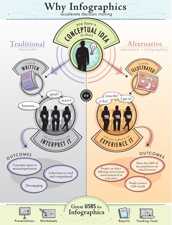
Of course a fine way to show the need for and proper use of the infographic is with an infographic.
The visualisation of data that works the best, from my experience, is tailored specifically to the audience. To that point, TED presented a great talk from David McCandless on the visualisation of data. This is definitely worth the 18 minutes to watch.
How do you present complex data? Your comments will be eagerly read by this young “New Kids on the Blog” blogger.
 Kyle Nel is manager, customer insights – food and small formats – at Walmart.