by Sarah Jane Johnson
Banking is one of the more challenging categories when it comes to brand differentiation. First of all, most banks are really pretty similar: large institutions offering more or less the same products: savings accounts, mortgages, credit cards and loans. Secondly, specific offerings are complex and can be difficult to compare directly.
For many years, Canadian financial services seemed stuck in a world of lookalike brands. Every bank ad relied on the same tired clichés: smiling couples in the offices of helpful-looking bank employees, or proudly clutching the keys to their new home. Clearly, the intended message was that banking with X would make you feel happy and confident. But, the proliferation of this type of advertising did little to differentiate individual banks. More importantly, it failed to tap into some of the more powerful cultural discourse around wealth and banking.
Here’s where Semiotics can truly play a role.
Semiotics shines in categories – like banking – where it can be hard to articulate brand differences through language. Language often relies on rational argument and proof. Semiotics is about the power of suggestion, creating associations for brands through the use of symbolism that has powerful cultural and emotional significance. In fact, as neuro-science has revealed, this approach might actually be more motivating.
As we now know, 95% of decision-making occurs at the subconscious level, by processing non-verbal cues like imagery, scent, colour, and music, all of which are the province of Semiotics. Deploying these semiotic cues can help brands build stronger emotional relationships with consumers at the powerful sub-conscious level.
It’s important to note that Canadian banks’ communication challenges are somewhat different than those of other markets around the world. In other countries, public trust has been severely eroded by banking’s role in the financial crisis that led to the recession of 2007. In Canada, trust was actually increased by the fact that Canadian banks avoided the financial crisis due to their more prudent approach to lending. In fact, the Canadian banks’ policies offered significant protection to the Canadian economy such that most Canadians weathered the global recession more or less unscathed.
This strong sense of public trust meant that Canadian banks were not faced with the job banks had in other countries: attempting to re-build trust with disenchanted consumers. Banks were generally seen as trusted institutions, although there were the inevitable complaints about banking fees taking advantage of the little guy. However, Canadian banks were also seen as remote and impenetrable, a perception reinforced by the monolithic bank towers in every major city, and the high bank counters, creating a symbolic barrier between customers and tellers in every branch.
But, one impact that the global financial crisis did have on Canadian banking was that it increased the importance of retail banking. As money markets and other global investments lost their profitability, Canadian banks suddenly found that loans and mortgages to the average punter became much more important to their bottom line. This made it critical to establish a deeper relationship with retail customers, and to provide stronger differentiation from their competitors.
The most successful banks did so (consciously or not) by effectively deploying Semiotic cues to create distinct positioning for their brands that truly tap into anxieties about wealth and financial security. In doing so, they began to engage in a powerful cultural conversation with their customers.
In Canada, as everywhere, achieving wealth is a significant preoccupation. However, over the past ten years, the cultural discourse about wealth has been evolving. Traditionally, wealth meant material wealth: assets and consumption. But, with global economic uncertainty, and a job market that works people incredibly hard, only to summarily dismiss them, new notions emerging are about what it means to be wealthy and the best way to go about achieving it.
Traditional Canadian discourse had two simple perspectives on wealth and banking: 1) The only wealth is Material Wealth and 2) A good bank is one with Authority. Essentially, the message all banks conveyed was “You can trust us to help you build wealth because we are established, and secure and WE UNDERSTAND these things.” Bank architecture resembled Temples or Palaces, Semiotically conveying their power and prestige. Bankers controlled the relationship and customers had to conform to their conditions, including opening hours.
The Royal Bank of Canada (now known as RBC) is Canada’s largest bank and as the market leader does an excellent job of occupying this traditional territory Semiotically, as can be seen in this recent ad:
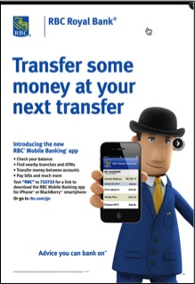 Its blue and gold colour scheme connotes royalty, wealth, and authority, suggesting a bank that is firmly established, prestigious and expert. The use of the “British Banker” mascot reinforces and deepens these associations by evoking the cultural myth of British banking as the archetype of the Money-Making Establishment, as well as tapping into a certain Canadian nostalgia for being part of the British Empire. At the same time, the cartoonish aspect of the mascot takes the edge off the authority he conveys. All of these Semiotic cues will resonate with customers seeking a big, established and prestigious place to keep their money.
We can see how banking discourse has evolved somewhat with this ad from TD, Canada’s second largest bank, which also uses Semiotic cues to connect with its customers: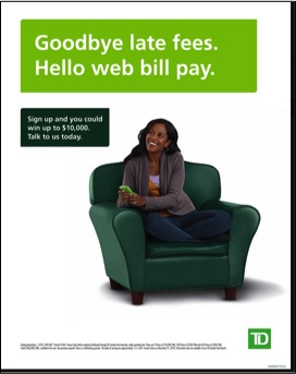 Like RBC, TD seeks to associate itself with Material Wealth through its use of the colour green, which in North America signifies money. However, TD differentiates itself from RBC by positioning itself as a Nurturer, rather than as an Authority. Nurturing is suggested by the icon of the green armchair, which looks both comfortable and supportive. The implication is that TD is a bank which is accessible and which puts its customers first, unlike the high-handed approach of traditional banks.
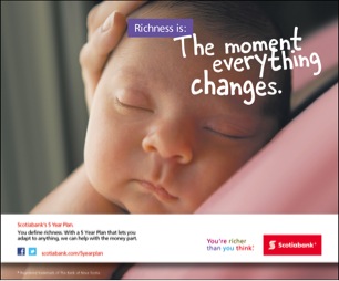
A smaller upstart bank, President’s Choice Financial, also positions itself against Authoritarian “Big Banking” as the low fee, low bureaucracy option for building Material Wealth. It taps into the cultural discontent with Established banking fat cats who have huge profits via high fees, interest rates and other padding. President’s Choice Financial Semiotically conveys Transparency and Integrity via minimalist art direction. Its use of the colour red suggests good fortune and alertness.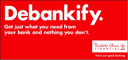 Scotiabank, on the other hand, has chosen to differentiate itself by re-framing the meaning of wealth. It consciously reflects the current cultural conversation about global economic uncertainty and the dark side of striving success by positioning itself as a supporter of Spiritual Wealth vs. Material Wealth. Its advertising presents “meaningful moments” as true richness, and suggests that unlike other banks, it understands “what really matters”. In place of the Trust that Material Wealth aligned banks evoke, Scotiabank evokes Optimism: with our help, the important things are attainable.
 Credit Union Vancity offers another challenge to the notion of Material Wealth by taking an explicitly ethical stance. Its promise of “good money” (aka: ethically sourced) is Semiotically reinforced by the image of people participating in a natural harvest. It also Semiotically distances itself from the “Big Banks” with its “handmade” looking art-direction. Yet, at the same time, like RBC, it positions itself as an Authority (as the answer to its own rhetorical question) and source of Prestige, with its invocation of personal pride.
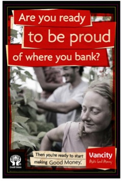 Upon closer examination, it becomes evident that the four themes most heavily leveraged in this category, Material Wealth vs. Spiritual Wealth, and Authority vs. Nurturing, are in fact natural opposites (not surprising as each theme is essentially a response or anti-thesis to the other).
These opposites can then in turn be plotted on two axes, allowing for the creation of a Semiotic Positioning map, that places each of the banks in its own distinct quadrant or territory: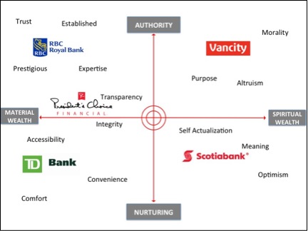 As we can see, RBC Royal Bank strongly occupies the quadrant of high Authority and Material Wealth, giving it a unique ownership of the cues associated with establishment banking: prestige, longevity and business acumen. This allows it to position itself towards customers who are seeking an established, trustworthy authority to help them grow their money.
In contrast to RBC’s more paternalistic position, TD Bank is more maternalistic, but still focused on traditional associations with material wealth. This allows it to appeal to customers who are put off by intimidating cues of high status and aloofness, but still seek a trustworthy venue for investment.
Scotiabank shares TD Bank’s nurturing stance but its position in the Spiritual axis signals an embrace of more progressive notions of wealth as a more meaningful way of life. This provides reassurance and a kind of transparency and trustworthiness for customers concerned with the realities of today’s economy and their ability to have the life they want.
Finally, Vancity, occupying the quadrant of Authority and Spiritual Wealth, is evoking a moral authority instead of a social one, and evangelizes a vision of wealth that is outer-directed and beneficial to others. This positioning, while niche, will appeal to those truly disillusioned with traditional Capitalism and traditional banking — and provides a venue for them to express their values while still having the safety net of a trusted place to invest their money.
But, there is one outlier we have not discussed yet. CIBC is another one of the “Big Banks”, but unlike all the other Financial Institutions (large and small) we have discussed here, it is not making an effective use of Semiotic cues, nor is it really taking part in the overall Cultural Conversation of the banking category. This CIBC ad epitomizes the clichéd “smiling happy customer” school of traditional advertising, and does not appear to convey any meaning beyond just that. The woman’s context is unclear – she appears to exist in a vacuum, as does the brand itself. It does not take a stance on any of the main poles of the category discourse: it does not evoke Authority or Nurturing. It appears to support neither Material, nor Spiritual Wealth. Semiotically, it conveys very little for customers to connect with. The only clear Semiotic cues are its colour scheme, a dated burgundy and gold combination that primarily evokes the 1970s. Frankly, it appears a bit lost, a fact which maybe reflected in its market share: it has the lowest share of any of Canada’s “Big Five” banks.
Brands that lack a clear point of view would benefit from the use of Semiotic Analysis, to help them understand the true Cultural Conversation at play in the category and to help them identify the most resonant Semiotic Cues they could use to position themselves within that conversation.
In a time when it’s more important than ever for brands to stand out from an increasingly crowded field of brands and ads, Semiotics offers the opportunity to increase cultural and emotional resonance with customers and prospects. And that’s something any brand can take to the bank.
Sarah Jane Johnson is a Principal at Toronto-based Athena Brand Wisdom. She can be reached on Twitter via @AthenaBrand


1 comment
Very good and nice article!